
|
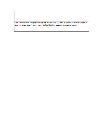
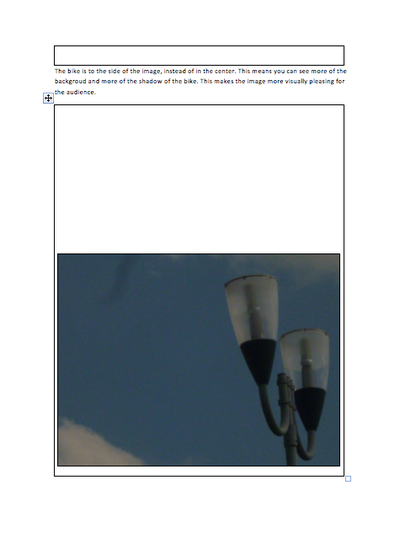
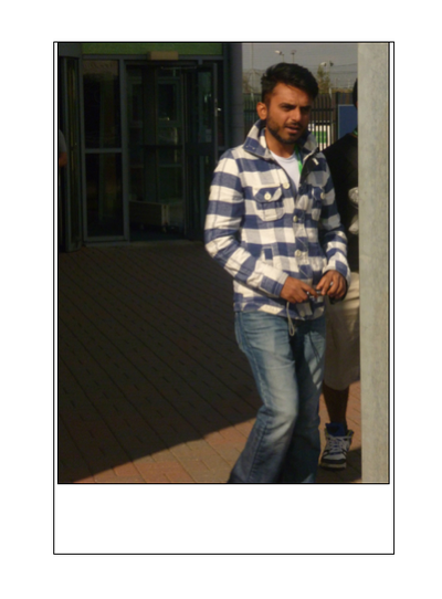
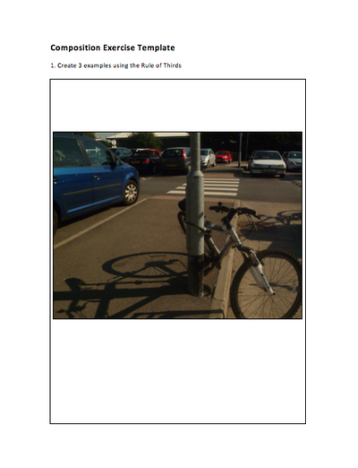
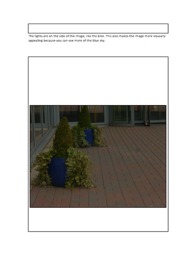
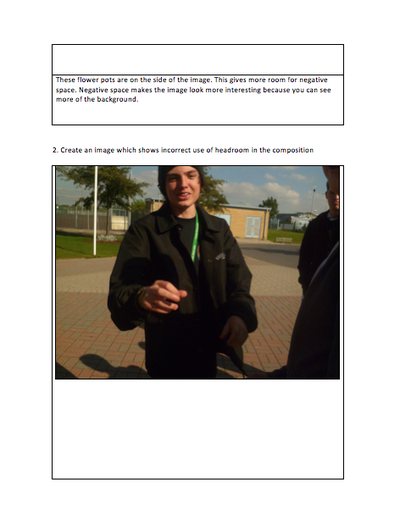
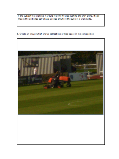
If photos don't show, then please click on the title of the blog post. The bike is to the side of the image instead of in the center. This means you can see more of the background and more of the shadow of the bike. This means you can see more of the background and more of the shadow of the bike. This makes the image more visually pleasing for the audience. The lights are on the side of the image, like the bike. This also makes the image more visually appealing because you can see more of a blue sky. These flowerpots are on the side of the image. This gives more room for negative space. Negative space makes the image look more interesting because you can see more of the background. This image shows incorrect use of headroom because more if his head is chopped off. There should be a good space between the subject’s head and the top of the shot. The shot feels too compact with his head mostly chopped off. This shows correct use of headspace and doesn’t feel too compact because there is a clear space between the subjects head and the top of the shot. If the subject were walking, it would feel like he was pushing the shot along. It also means the audience cant have a sense of where the subject is walking to. The lawn mower has plenty of space in front of it, as well as plenty of space behind it and we know that its not going to feel like it is pushing the scene along. Comments are closed.
|

Will TownsendA keen videographer and photographer. Currently studying Level 3 Creative Media Production at SGS WISE Campus, Bristol. Archives
November 2015
Categories
All
|
 RSS Feed
