
|
To create this, I used garage band and Premiere Pro. I also created foley tracks to make sounds effects. An example on one of the sound effects I made was the splash of the puddle at the start. This was originally a tap in the gents toilets pouring a shot amount of water at one time.
0 Comments
Music and sound two of the most important features when it comes to editing a film. A good example of this is the music used in Star Wars when Darth Vader enters a scene, it's very dark and suspenseful and allows the audience to realise that he is the villain. If the music was changed to a more uplifting, cheerful tune then the purpose would be completely ruined. The audience would get the impression that Darth Vader's character was created as a joke and would make the film look like a parody genre. Sound effects are also very important. If it wasn't for good sound effects then it would make the film look fake and would also make the acting look bad. Sometimes, actors create the sound effects themselves while on set performing a certain action (slapping somebody for example). However usually the sound effects are created by foley artists (the art of recording the sound effect of one thing to make it sound like something else, eg: screwing up paper may sound like a crackling fire). Sound effects help to immerse the audience by making them believe that the actions of a character are real (like shooting a gun). In the YouTube clip below, somebody shows the how the film genre changes when the music is changed. The difference is extraordinary. A two shot is used to allow the audience to be able to see the relationships between the two characters. To achieve this shot you must have to characters stood in shot. I have noticed that it doesn't particularly matter whether the characters are talking or not because you are usually able to compare their facial expressions. A good example of a two shot would be a mid shot with two characters in shot, this allows the audience to view facial expression as well as body language. Two shots are often used at the beginning of characters relationships (or when they first meet). In this shot you can see the two characters discussing something over a meal in a cafe or restaurant. We know that one character is much older than the other so instantly we can see that he maybe giving him advise or sending him on some sort of mission. This clip also uses the "vertigo shot" which is used to emphasise a character or make the audience feel fatigued. It's created by bringing the camera backwards on a dolly while zooming in with the lens. It makes it look as if the background is zooming in.
Originally I used a steady cam for my logo as I use a steadycam whenever I film but eventually I came to the decision that it wasn't very suitable for a logo. I decided to base my logo on the glasses that I wear because many people know me for my glasses.
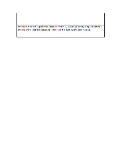
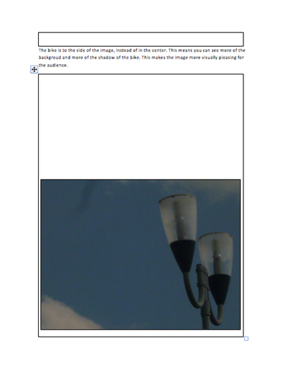
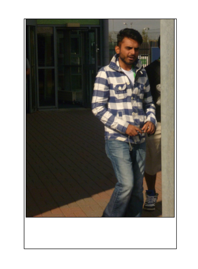
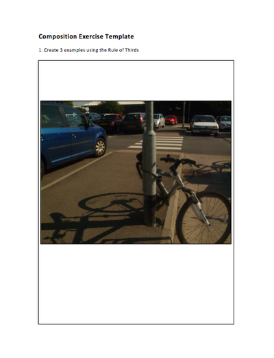
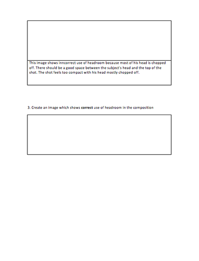
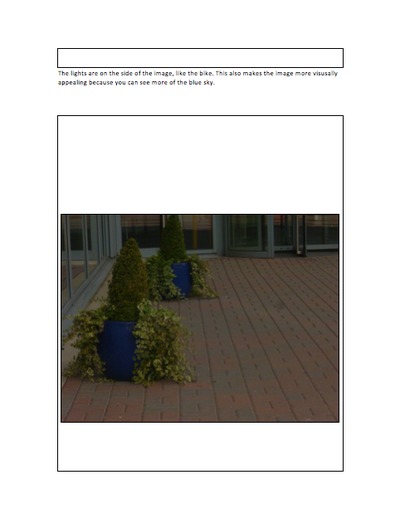
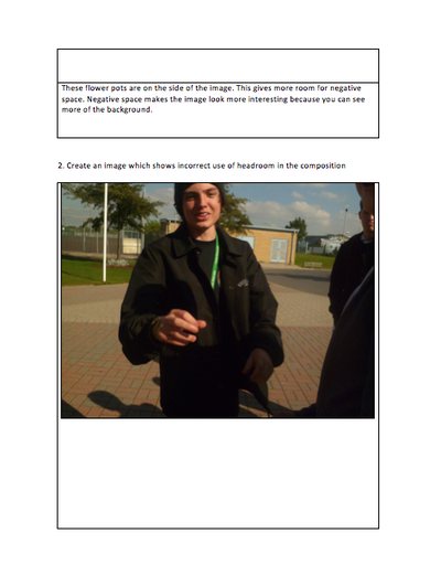
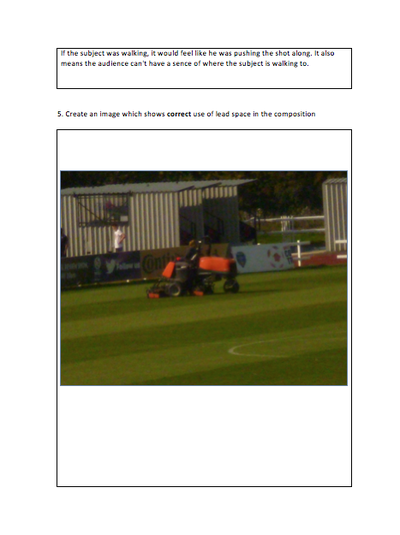
To create my logo, I took a picture of myself (yes, a selfie...) and then put the picture into photoshop. I rubbed out my face using the eraser tool and the quick selection tool and ended up with only my glasses. I then used a colour overlay to make them black and added the dots on the sides using a white brush. To create my ident I used Adobe After Effects and Premiere Pro. I began by choosing a background from Google. I was looking for something that would give my ident a black glow around the edge. I came across the current background and it gave me the idea of an old film. I then inserted this background into After Effects as well as my logo PSD. I changed the blendmode of the background to make my logo have a brown burn effect. After looking on an old memory stick I found stock footage of a film camera flicker overlay, so I added this to my project and changed the blend mode of the layer. Finally I put the project into Premiere and added the sound of a film projector as well as added a "fade from black" and "fade to black". Outcome: I must say that I am extremely happy with my ident. I feel it is original and unique. I also feel that the simplicity helps a lot because of the lack of animation of the actual logo. If photos don't show, then please click on the title of the blog post. The bike is to the side of the image instead of in the center. This means you can see more of the background and more of the shadow of the bike. This means you can see more of the background and more of the shadow of the bike. This makes the image more visually pleasing for the audience. The lights are on the side of the image, like the bike. This also makes the image more visually appealing because you can see more of a blue sky. These flowerpots are on the side of the image. This gives more room for negative space. Negative space makes the image look more interesting because you can see more of the background. This image shows incorrect use of headroom because more if his head is chopped off. There should be a good space between the subject’s head and the top of the shot. The shot feels too compact with his head mostly chopped off. This shows correct use of headspace and doesn’t feel too compact because there is a clear space between the subjects head and the top of the shot. If the subject were walking, it would feel like he was pushing the shot along. It also means the audience cant have a sense of where the subject is walking to. The lawn mower has plenty of space in front of it, as well as plenty of space behind it and we know that its not going to feel like it is pushing the scene along.
As a task we had to film a scene from a feature length film. We started by creating storyboards following a brief and a script. The script was short because it only had two lines and the brief was describing the scene, characters and showing the stage directions but did not say what shots to include. Another thing that made the task harder was that we didn't know the name of the real film so we could not see how the scene was directed or filmed. When we actually got to filming, we based it off of Charlie's story board. Charlie acted as a director, I was the camera man and Liam and Ollie were actors. However everyone decided on which shots looked best. The editing was done by myself and then refined by Ollie with the addition of music and sounds. When we were actually filming, we didn't follow the storyboard exactly because we realised that some shots were not possible or didn't look very good so we changed them while filming. It was very easy to film because we had planned most of it, however we needed to decide on locations just before starting to film. Some shots we used were based off of the shot types and angles that we had studied from the blog post before.  Comparing the video to the original scene, we focused more on creating the scene than adding suspense to the chase scene. Also, we didn't really create a chase scene at the end unlike the original scene. The original scene used some dolly shots, however we were unable to do that so we used handheld shots and panning shots. We took care with our camera movement to make it as smooth as possible and shorter shots but in the original it seems that they have used shaky, longer shots. We made the choices we did because we felt that it was important to set the scene and introduce the characters, but we didn't really focus on the chasing scene which we should have done. The original clip focuses a lot on the chasing scene, however we hardly included one. I would add a longer chasing scene if we were to re-film it. To improve the original I would smooth the shots out so they weren't shaky or all over the place and i would make the shots a lot shorter. And as for ours, I would make the chasing scene longer. I liked the fact that we managed to do what we did on a very low budget. They used a lot of long shots in the original for running, however we used a lot of close up and mid shots. The meaning we used is the same as the original. The main character is being hunted down by a gang and eventually gets chased by one of their members. The member punches the character in our film but slashes him with a knife in the original. This could mean the gang member was trying to kill the character but we was only trying to harm him in our film. The setting of the original scene is firstly set indoors and he gets the papers out of a locker instead of his pocket. Ours isn't set like that however, it is all outdoors but theirs starts indoors and then they go outdoors. In my opinion this doesn't make any difference because they are still very similar settings (schools and colleges). The mood of the films change at the same time. For example, the mood changes in the original when he finds the papers and it's the same with ours.  Canon 600D; the camera we used to film. |
Will TownsendA keen videographer and photographer. Currently studying Level 3 Creative Media Production at SGS WISE Campus, Bristol. Archives
November 2015
Categories
All
|
 RSS Feed
